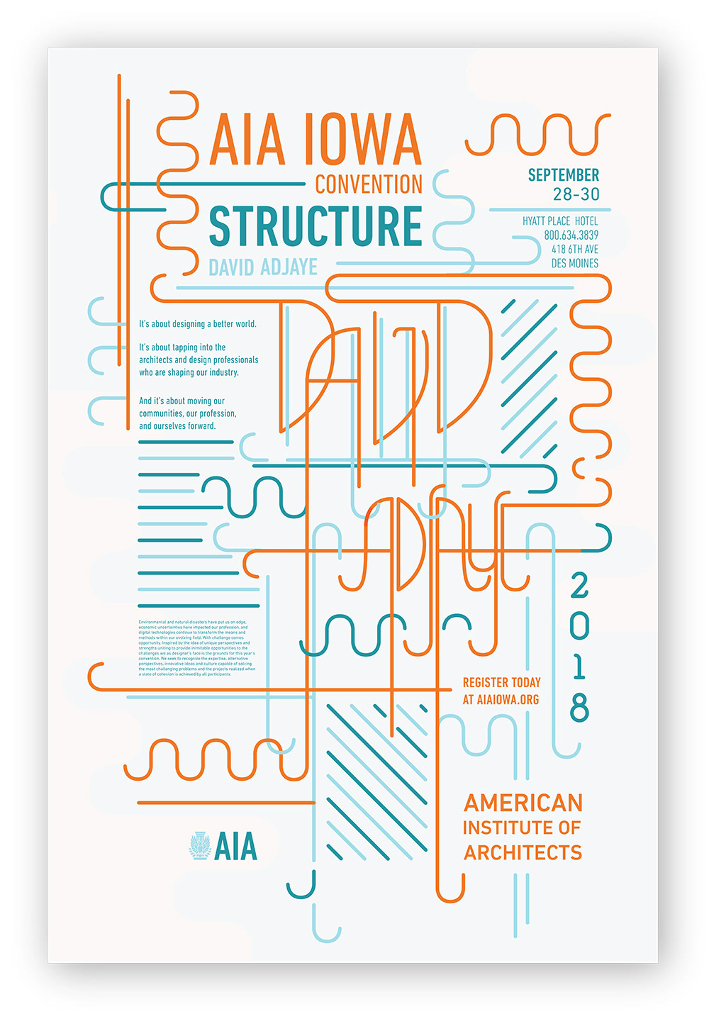
Typography II // Foldable Convention Mail Out
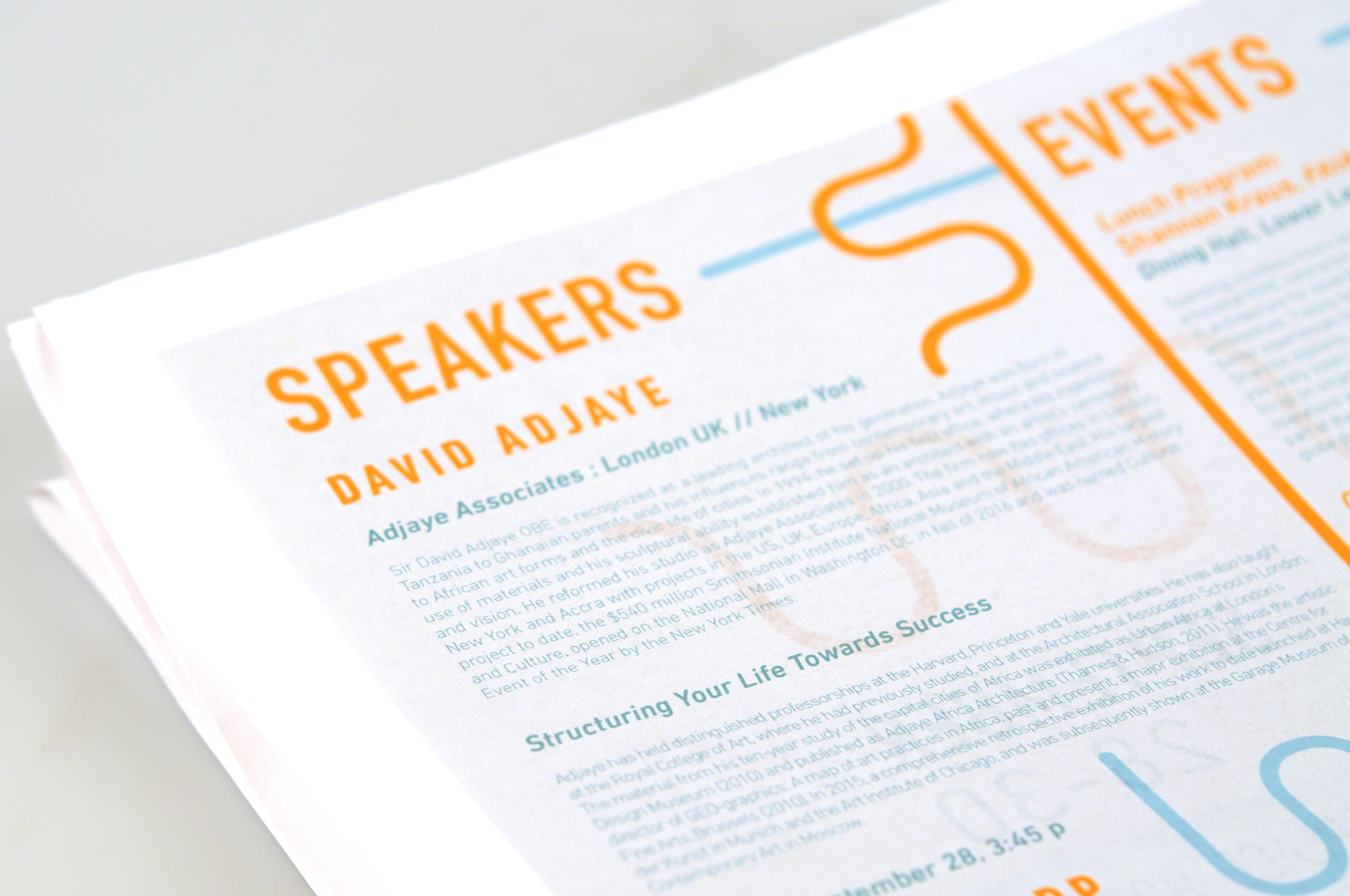
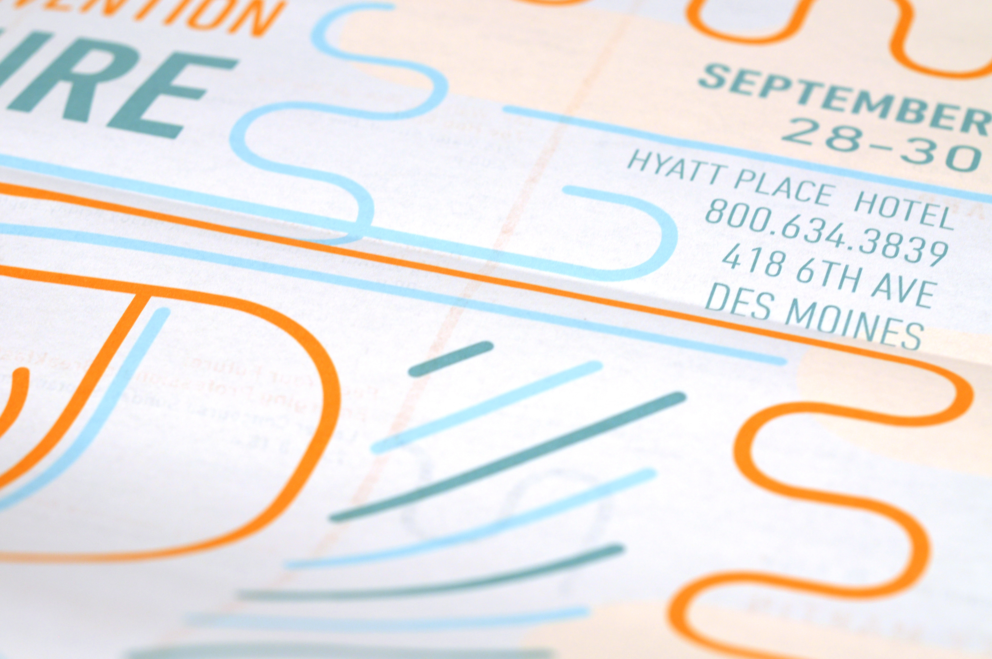
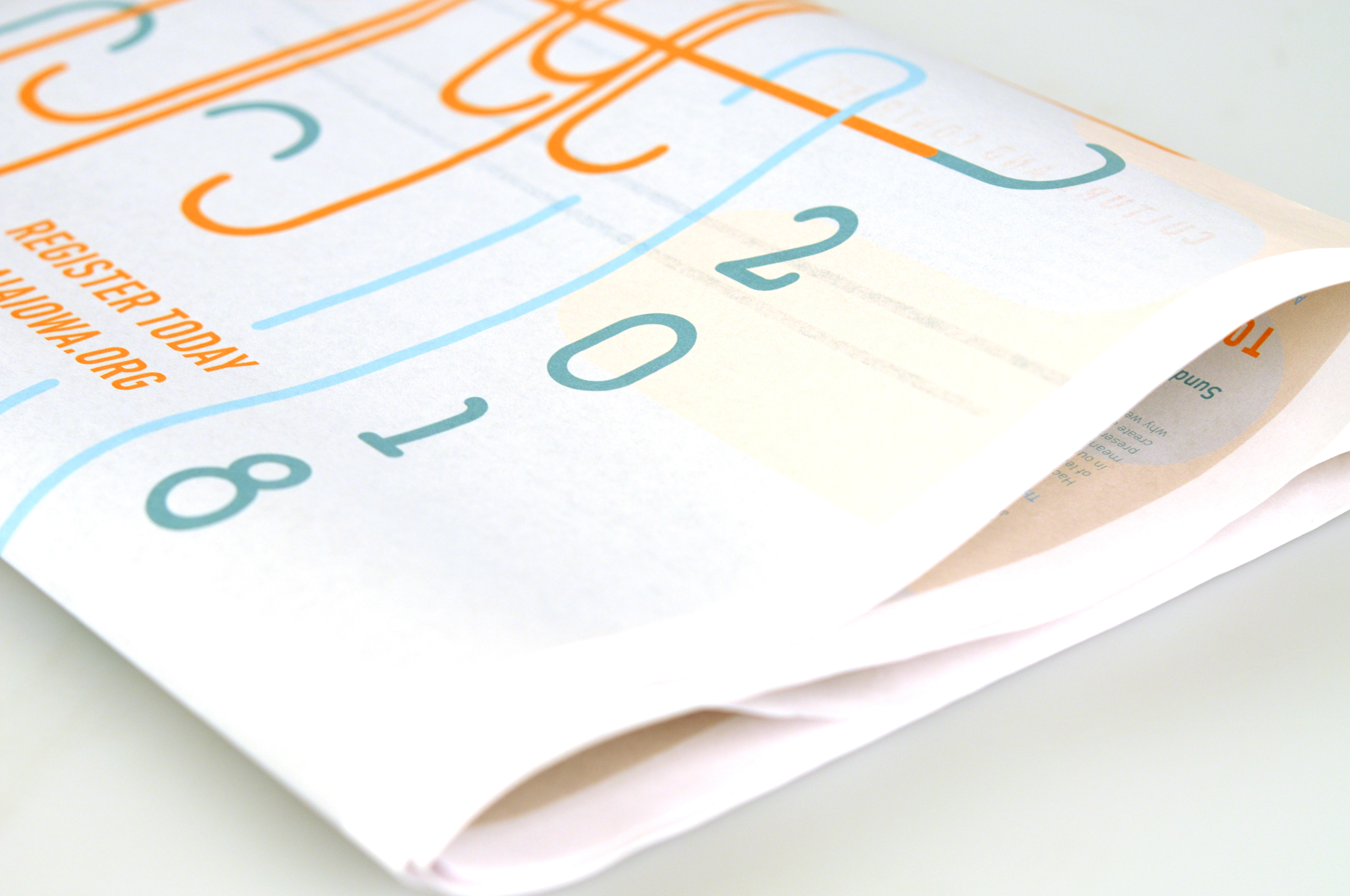
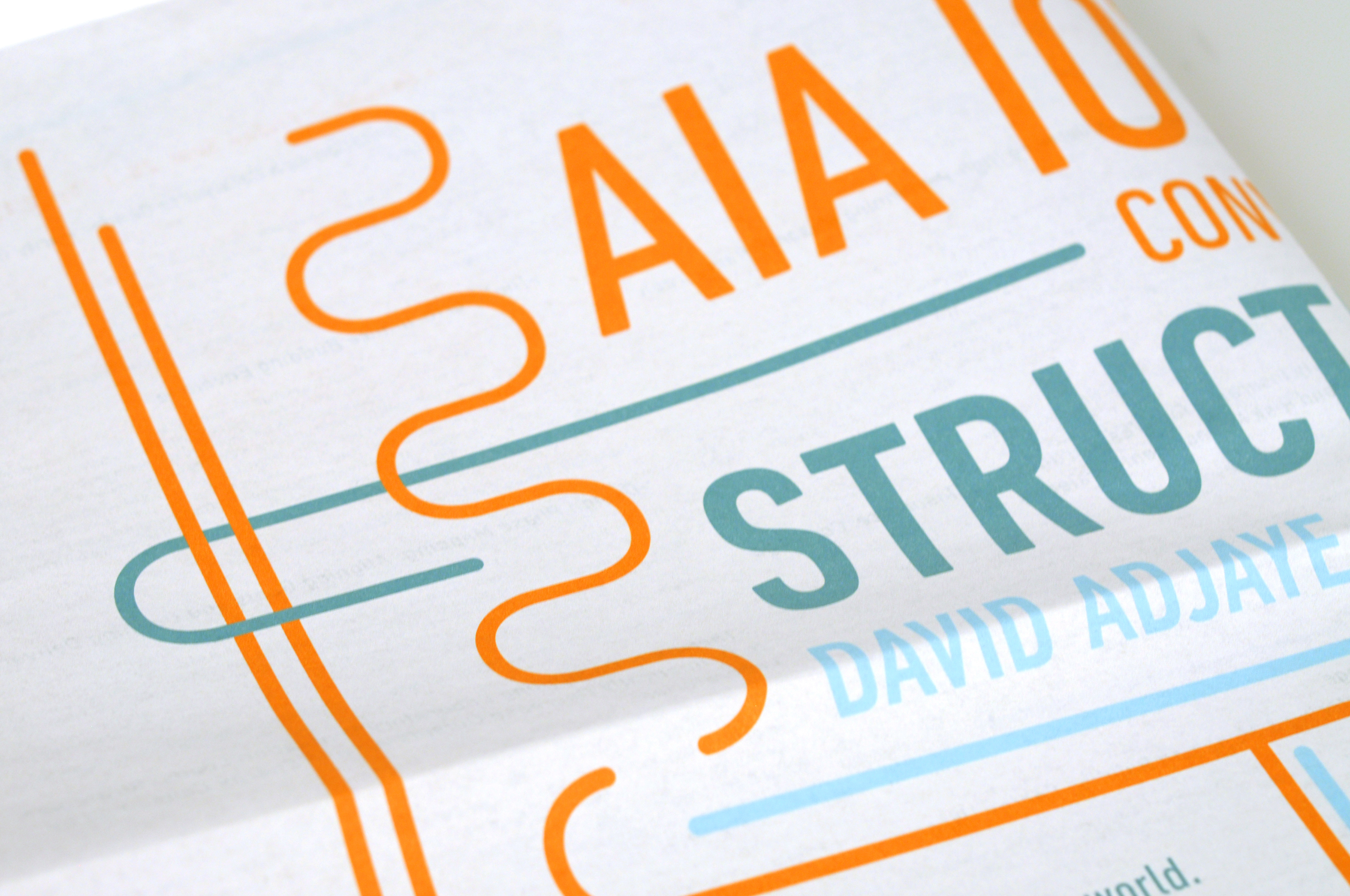
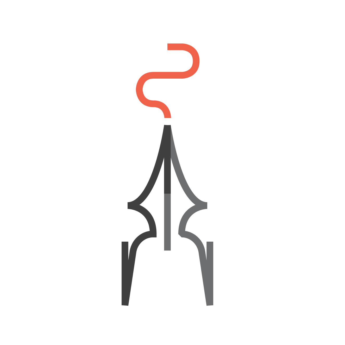
This project was built around an architecture convention with specific keynote speakers. Our goal was the use of type as a structure in relation to a specific architect, mine being David Adjaye. His buildings centered around curved and geometric forms in harmony with splashes of color. This in term led me to create a modular design with a sense of flow and hierarchy.
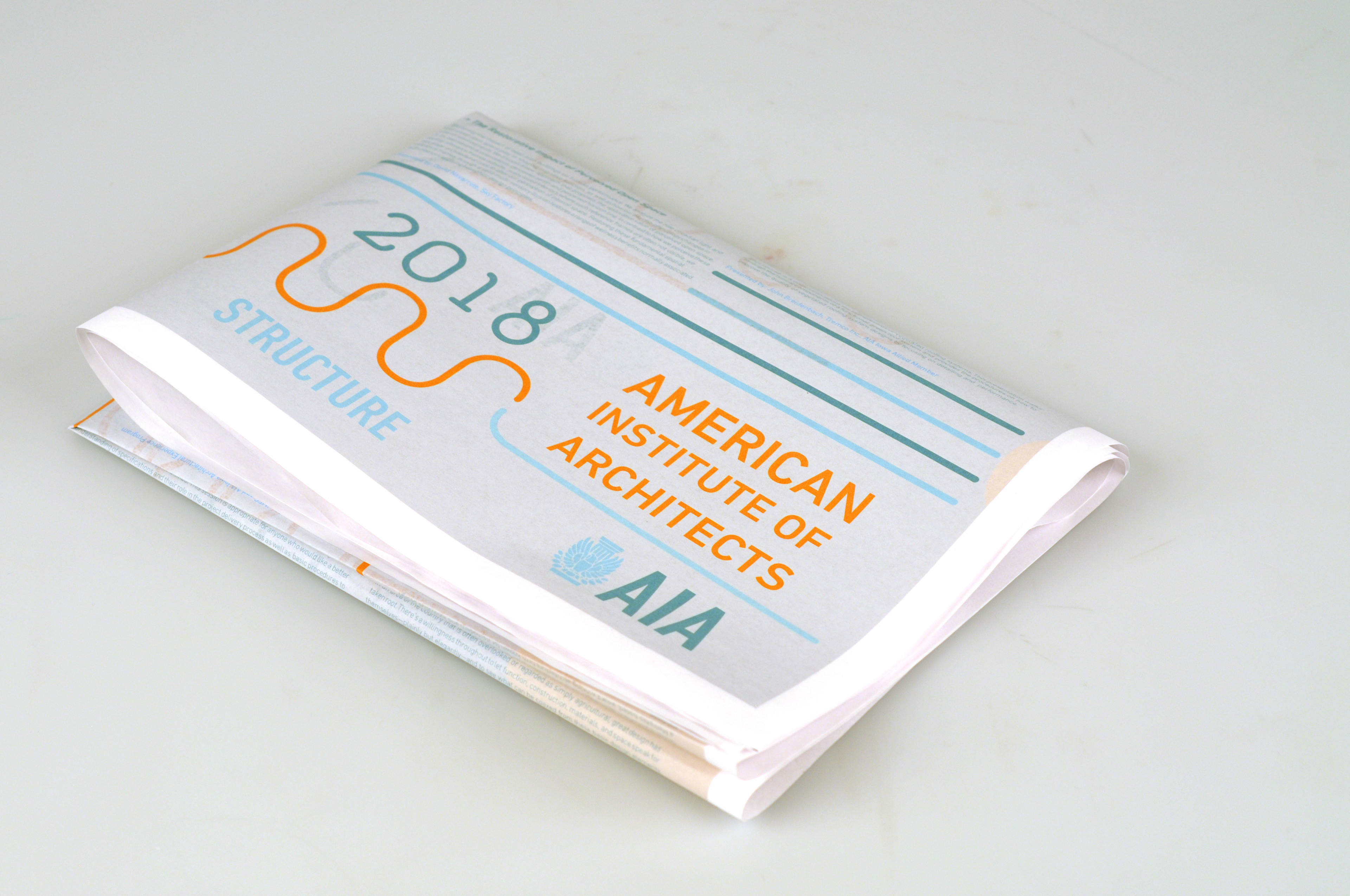
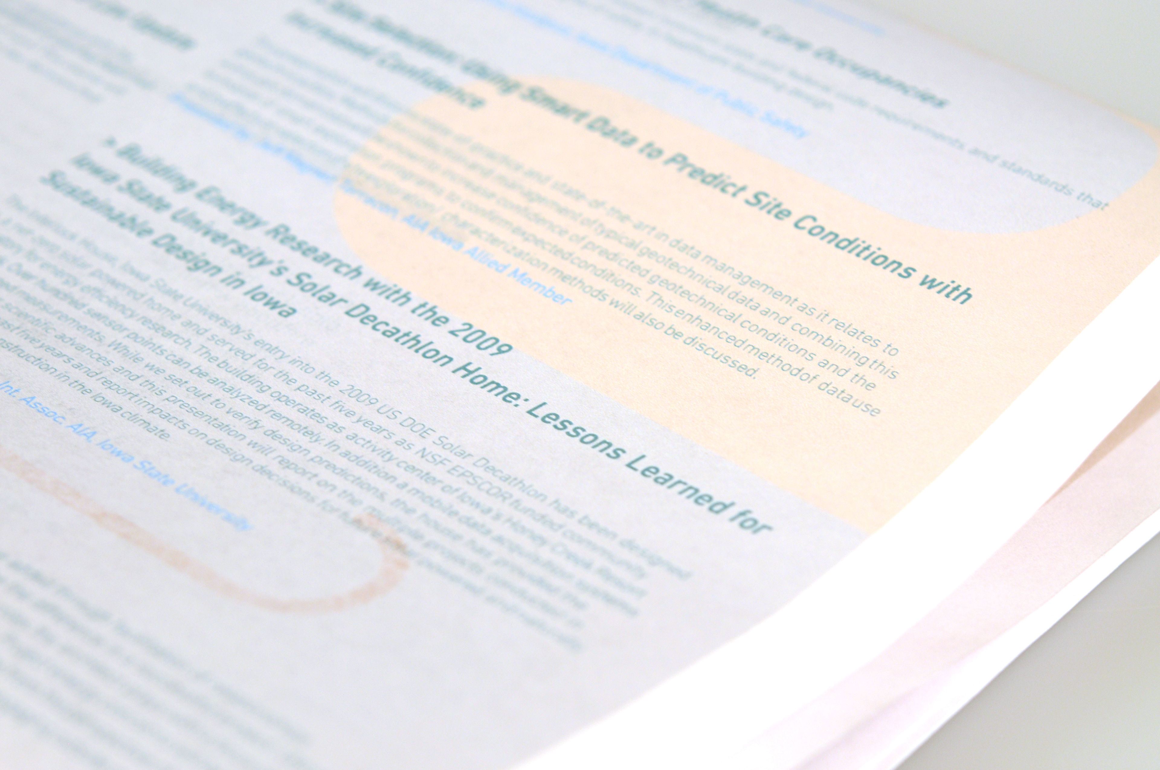
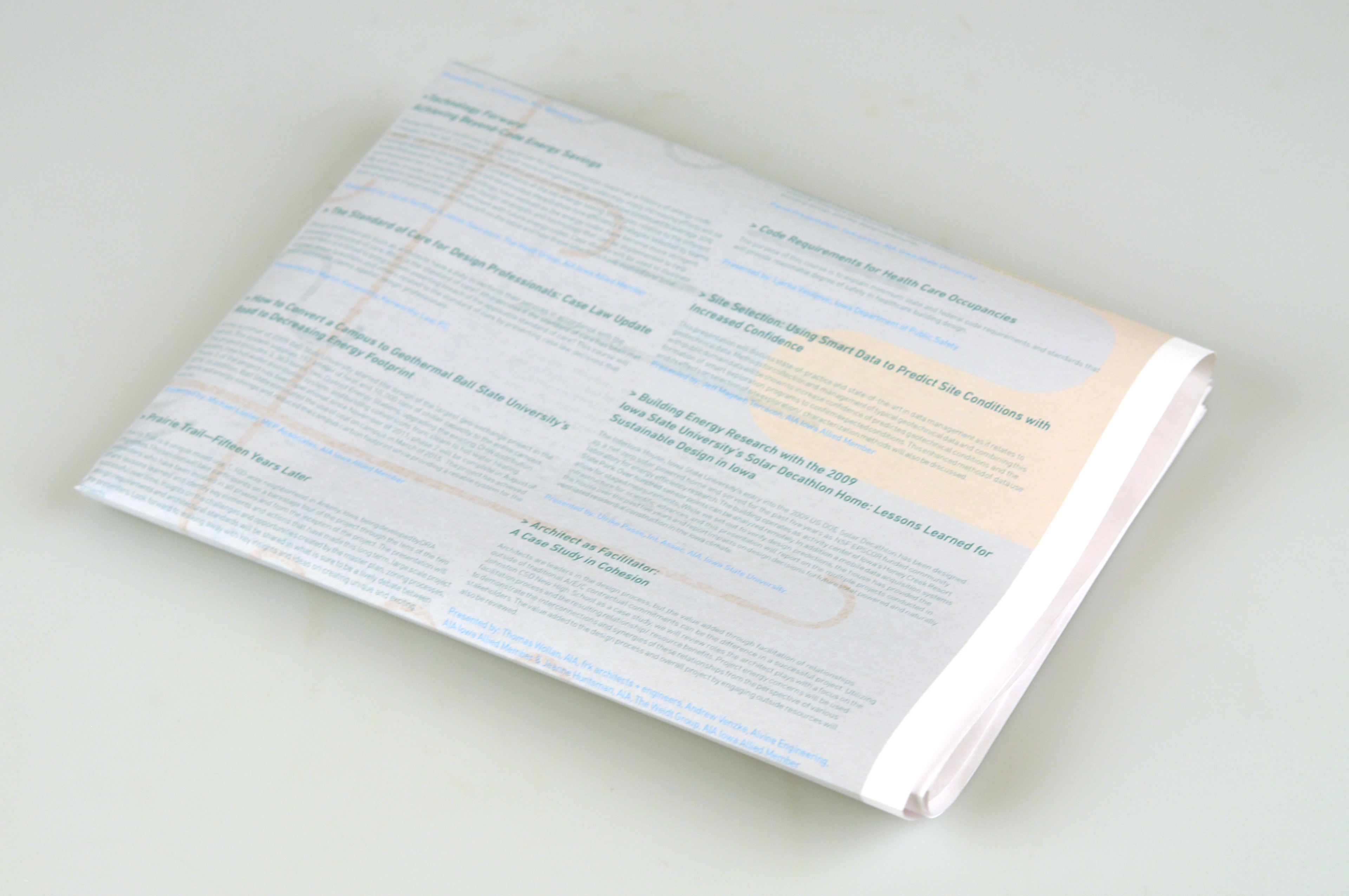
We were tasked with creating this flyer to be foldable. The large amount of text on the front and back had to be legible in according to its 3 x 2 fold. Below is front mockup, and an example of the folded print version in the photo grid.