Daisuki Rebrand & Style Guide // Graphic Design Studio
Final Product : 25 page book layout consisting of general details and guidelines.
Daisuki was a Japanese streaming site for anime & manga. It sadly dissolved as of late 2017, but held a high ranking as a streaming option while up and running.
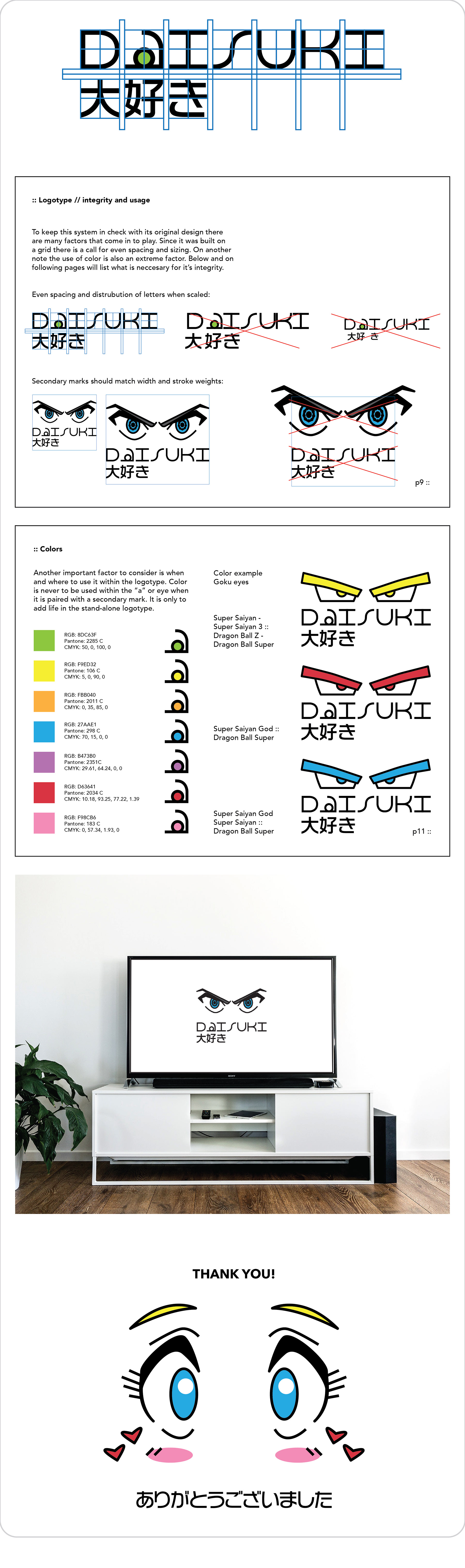
The word Daisuki means “I love” or “I like” in Japanese, and I wanted to capture the passion for viewing this content in the logotype. I created this typeface on a 2x2 grid in a single line stroke. Both the type and Japanese characters stack and scale perfectly in any setting. The eye color is interchangeable and would animate on screen just before a show would begin.
The deliverable for this project was a style guide that discussed how to use the elements of this brand. This included the do’s and dont’s, color usage, type treatment, and how to create new content to these specifics in the future.
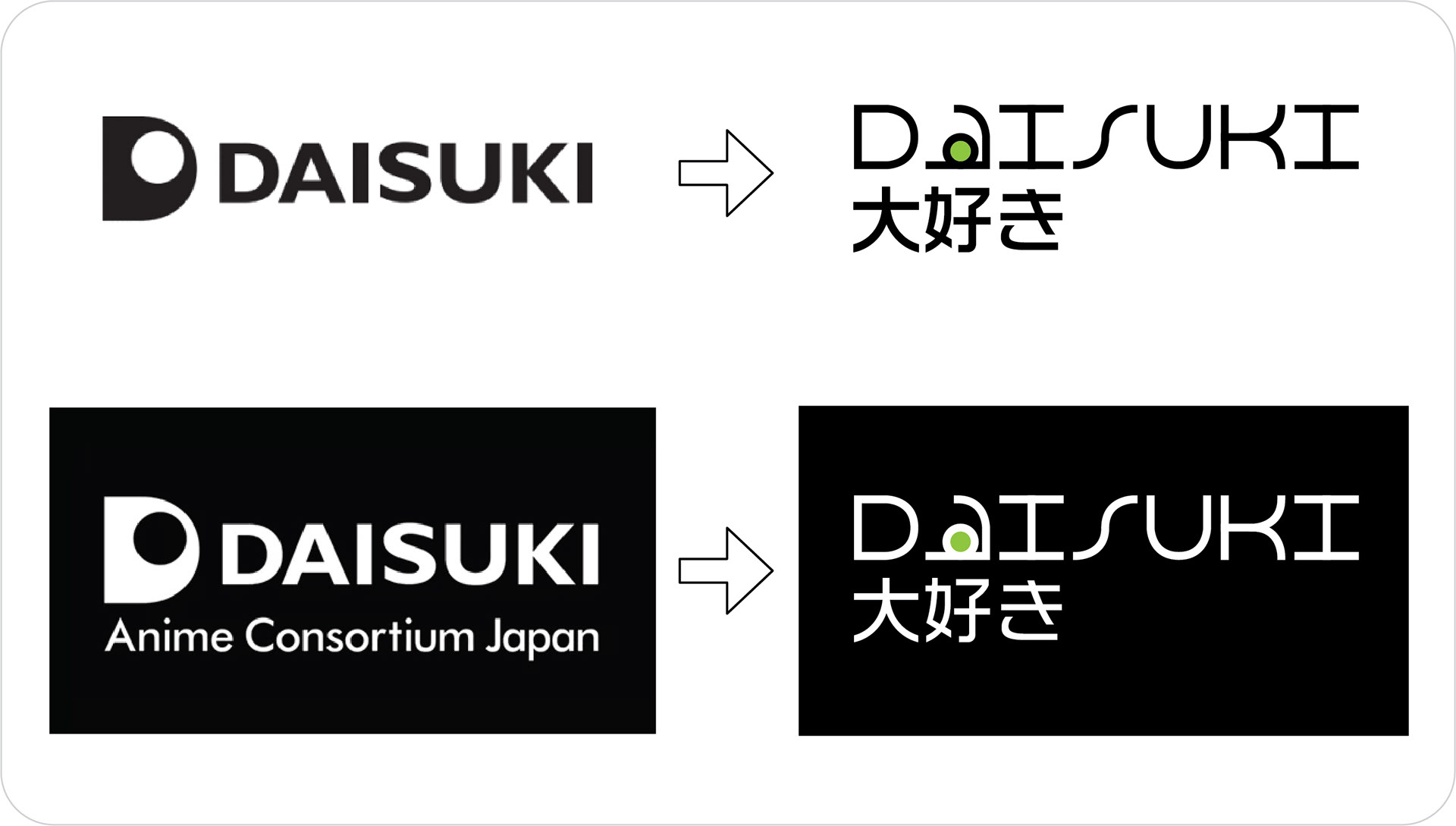
When creating my version I chose to integrate the eye from the original since its content is television based. Keeping integrity with the Japanese characters I decided to create a clean and legible font on a two by two grid. The color is interchangeable and can be seen in the inverse as well.
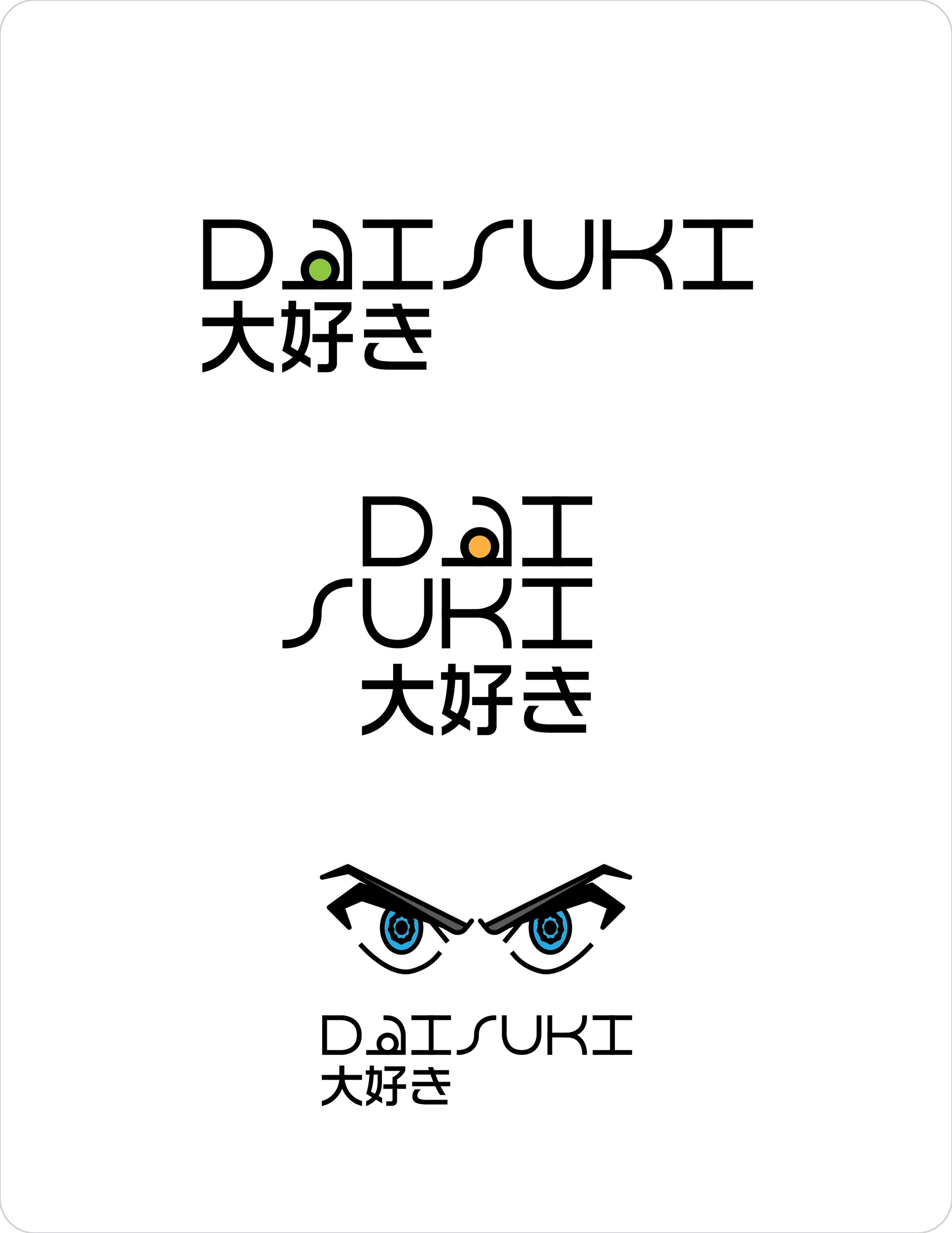
Lockup Examples // Placed above // Horizontal - Stacked - Paired with secondary elements.
Color is removed from the type when paired with secondary elements.
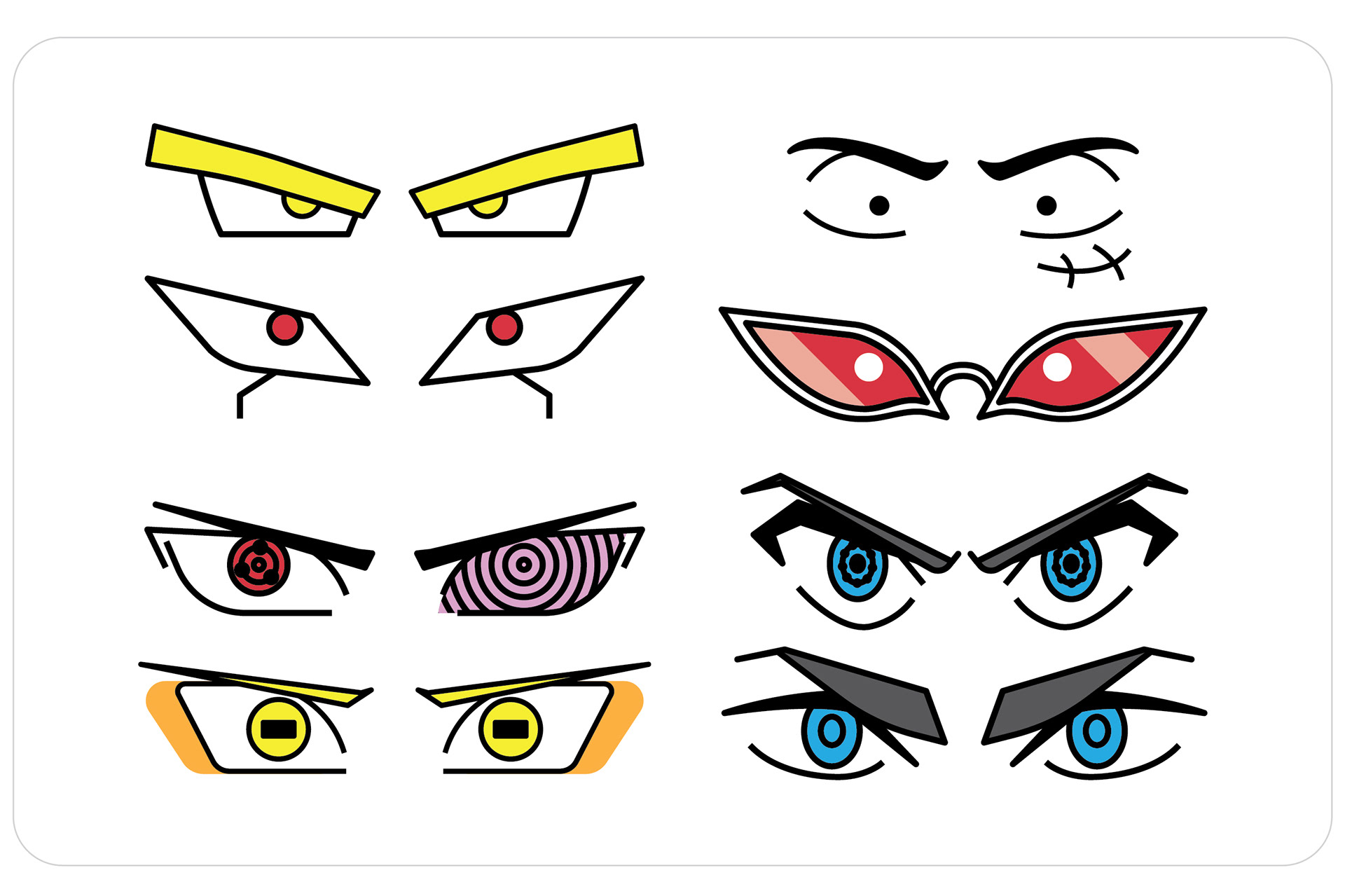
Example of secondary elements above // Prominent eyes from anime & manga
(Dragonball Series, One Piece, Naruto, Kill la Kill)
Above is a select few pages and mockups taken from the style guide to give a general understanding of layout and design. Booklets were set to 9 x 12 in. on matte paper (professor guidelines)
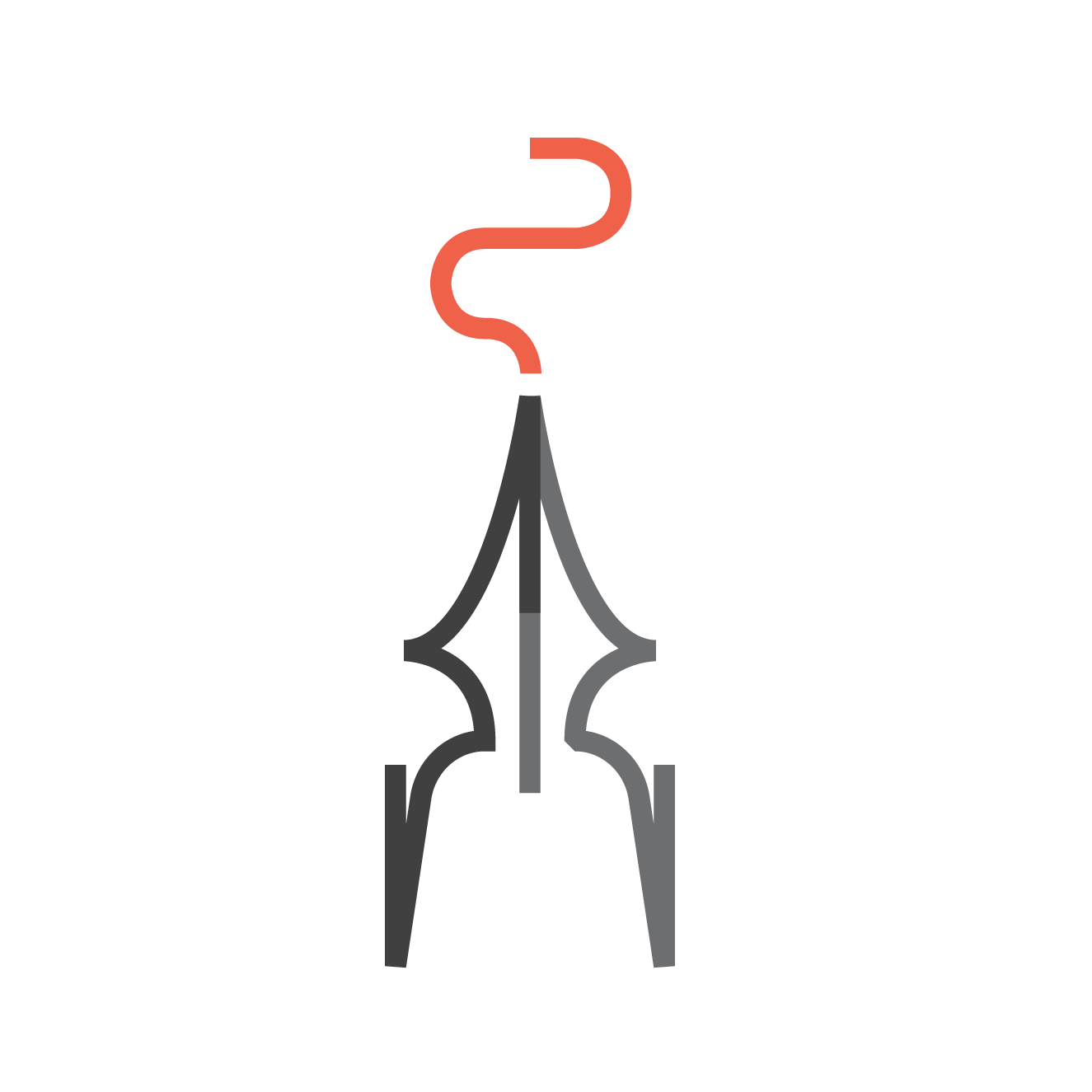
Pop up animation for screens - App load-up on an iPhone for example.
Thanks for Looking!